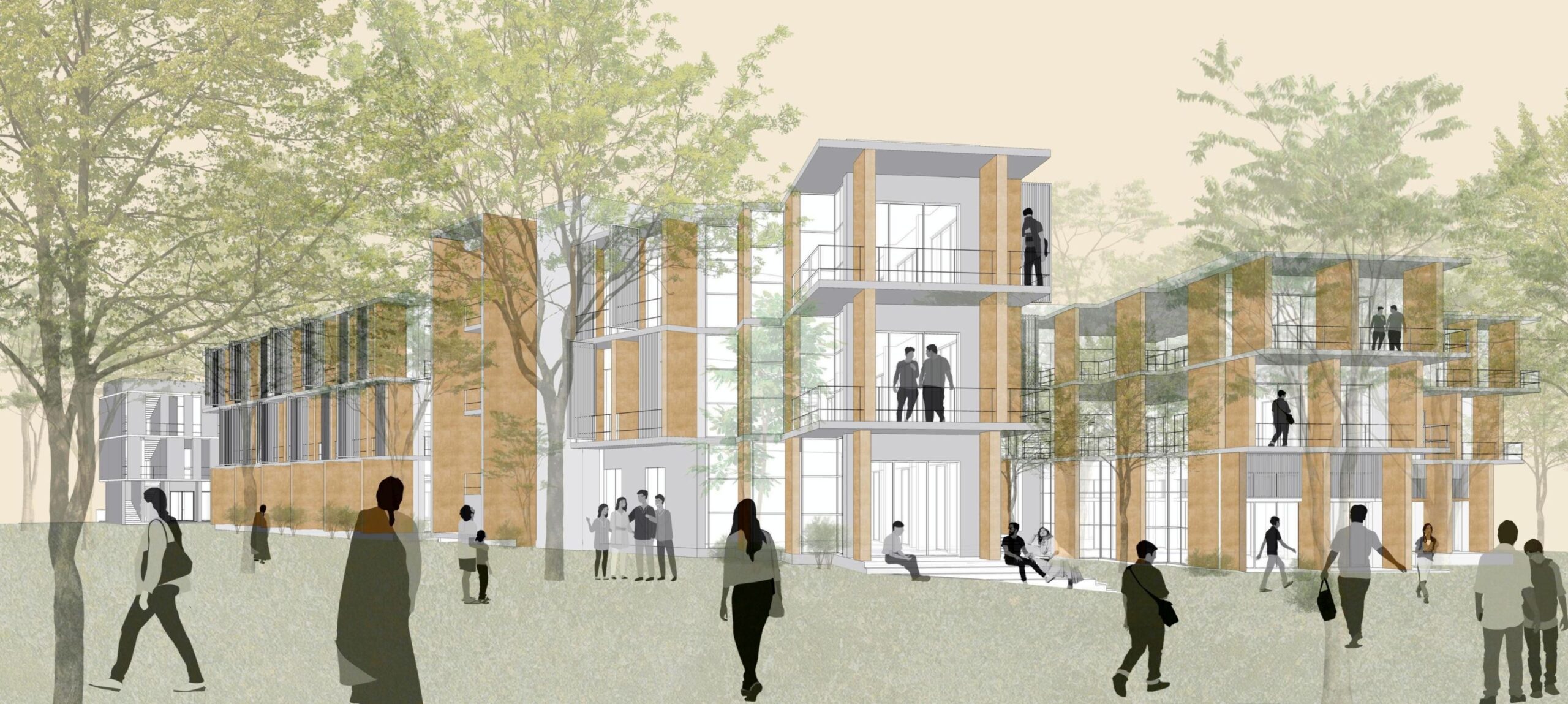
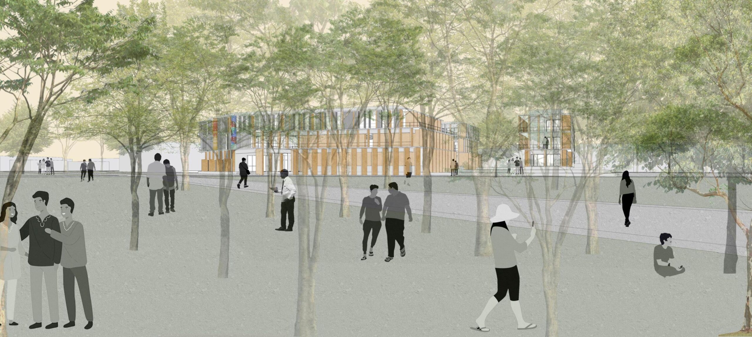
localground’s proposal for the new Centre for Excellence in Bengaluru by the Council of Architecture aimed to create a precinct that sensitively responded to the immediate context while enhancing the strong sense of the existing place. This was enabled by incorporating the set of beautiful heritage trees on the northern part of the site into the fabric of the building, putting them front and centre, with the buildings forming a quiet backdrop. The building embraced the trees, allowing nature to become a part of the daily experience of the centre.
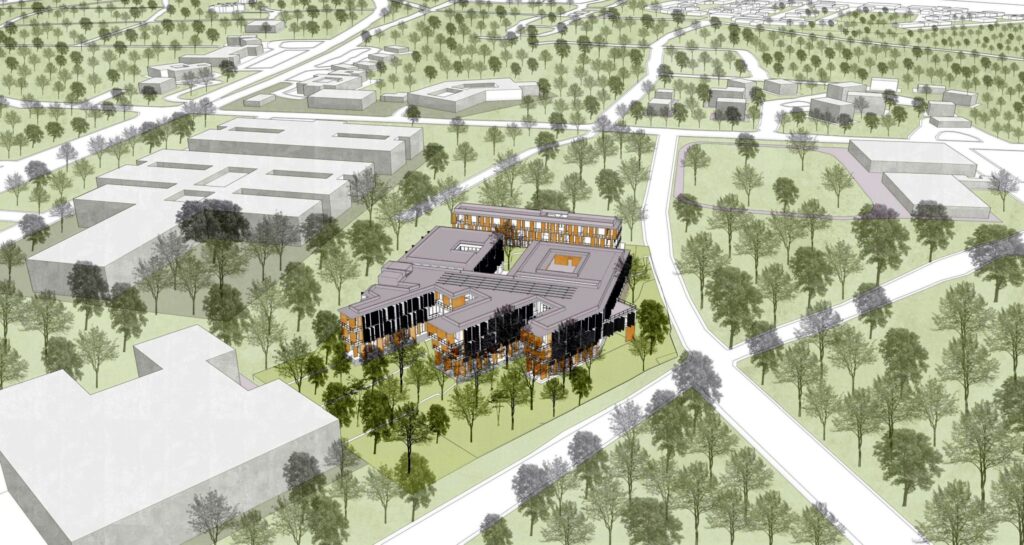
At the level of the campus, the design aimed to make the building open, accessible and an asset to the Bangalore University community. This was achieved by allowing easy public access to certain public amenities and creating new pedestrian connections. Public-facing functions like the auditorium, exhibition space and canteen were placed so that they could be easily accessed by the community members. Opening up both ends of the central public spine of the building, created a new pedestrian pathway to and from the Civil Engineering Department.
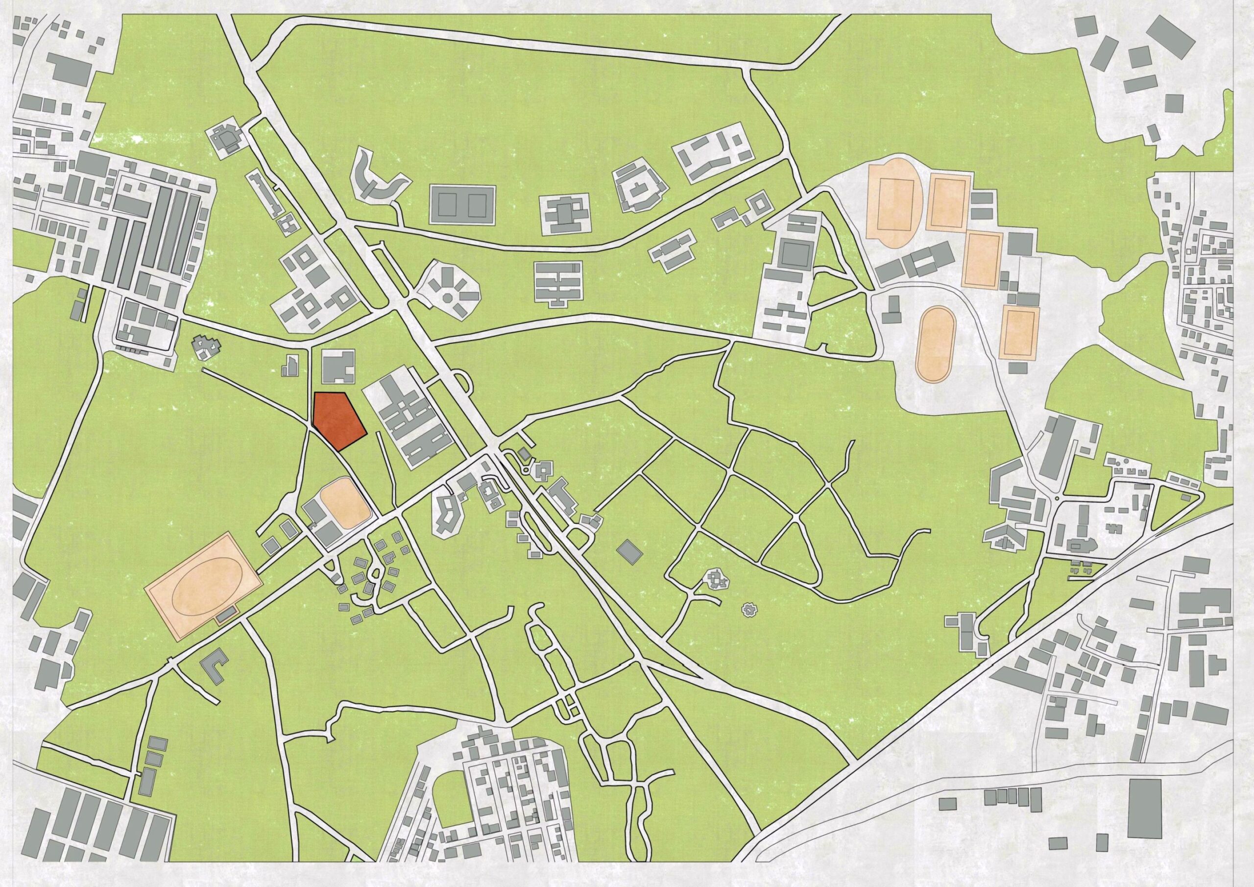
The building was planned such that the core functions of the Centre were appropriately located to maximise functionality and purpose of use for all stakeholders. The Resource Centre occupied the heart of the site, opening itself up to the rest of the campus to the east and the large central courtyard to the west. The main spaces of the Convention Centre- the auditorium and exhibition space were easily accessible on the ground floor. The Canteen could be accessed from the inside and outside of the building while the location of the Archives allowed for quiet research and suitable spaces for archival storage. The Guest House was proposed as a linear building at the south end of the site, detached yet connected to the core of the Centre by a pedestrian path.
The heritage tree plaza interlaced with the finger-like structures extending into the trees, the central core and spine, and the tree-filled courtyard at the centre of the building, created a series of spaces that allowed for uses ranging from large public gatherings, exhibitions and celebration, to the intimate setting of individual research. All this was linked by the constant presence of a verdant and profound landscape.
Approach and Ideas
The design proposal was approached through four lenses; simultaneously looking at the context and the programme and approach to both. These lenses worked together to form the proposal.
- The Campus: the Broader Context
- The Site: the Immediate Context
- The Building Programme: Interpreting the Brief
- Environmental Concerns: Passive Means


1. Approach to the Campus: The Broader Context
Extending, connecting to and reinforcing campus and site green spaces
The design of the Centre responded directly to the context it was set in. The building intentionally extended the verdant landscape to the north of the site, and the surrounding spaces, into and through the building. The ‘outdoor rooms’ to the north, the central green spine running east-west and the large treelined courtyard that the Resource Centre and the Auditorium opened into were all core elements of the design.
Creating a new institutional node at the street intersection in the West
The placement of the main entrance of the Centre at the intersection of the streets to the west of the site created two opportunities. To the west, it created a node that could potentially catalyse new development on the vacant plots across the street. The circulation spine that ran from the west entrance, through the building to the east, allowed for a new pedestrian connection to the Department of Civil Engineering and beyond.
2. Approach to the Site: The Immediate Context
Heritage Tree Plaza: Respecting, Responding to and Engaging with the trees on site
The north side of the site was envisioned as a plaza among the existing trees. The building flowed through the trees, creating opportunities for people to use the outdoor spaces under them. Spaces on the upper floors opened out through verandas and corridors to the foliage.
Building on a Sense of Place
A series of outdoor rooms complemented the various functions of the building. The tree plaza to the north was accessed from the administration, the exhibition space and the canteen. A wide landscaped strip of green ran along the central spine at the core of the building. The large courtyard between the auditorium and Resource Centre completed the ensemble of varied outdoor rooms.


3. Approach to the Building Programme: Interpreting the Brief
Functional Organisation of Building Programme: Public- outward facing, to the west and Institutional- campus facing, to the east
Public-facing functions like the Auditorium, Exhibition space, Administration and Canteen were outward-facing and accessible from the main entrance. The core institutional functions of the Centre, the Resource Centre and the Archives were placed on the inner side of the building facing east and the rest of the campus allowing for quiet and reflective spaces for learning and research work.
Structure of the Centre: Pedestrian Spine with a Green Edge
The design of the Centre was structured around a central pedestrian spine. This three-level central space was defined by the 3-meter wide open-to-sky linear landscape that ran along the entire east-west length of the building. All the various functions of the Centre were accessible from this spine, either directly, or via pedestrian connections.
Creating a Pedestrian Precinct
Vehicular access was restricted to the west side of the site, along the road that skirts the site. Parking was planned along the west side, the south side along the Guest House and in the semi-basement under the auditorium. The other parts of the site were entirely pedestrian, with several new connections being made from pathways to the north and east of the site.
4. Approach to Environmental Concerns
Passive Methods: Shaded Buildings that Breathe
From left to right: The design allows for easy cross ventilation. Timber screens made from recycled wood screen the harsh afternoon sun. The profile of the building allows for most spaces to be naturally lit.
Scale: A Low Rise Building staying within the tree line
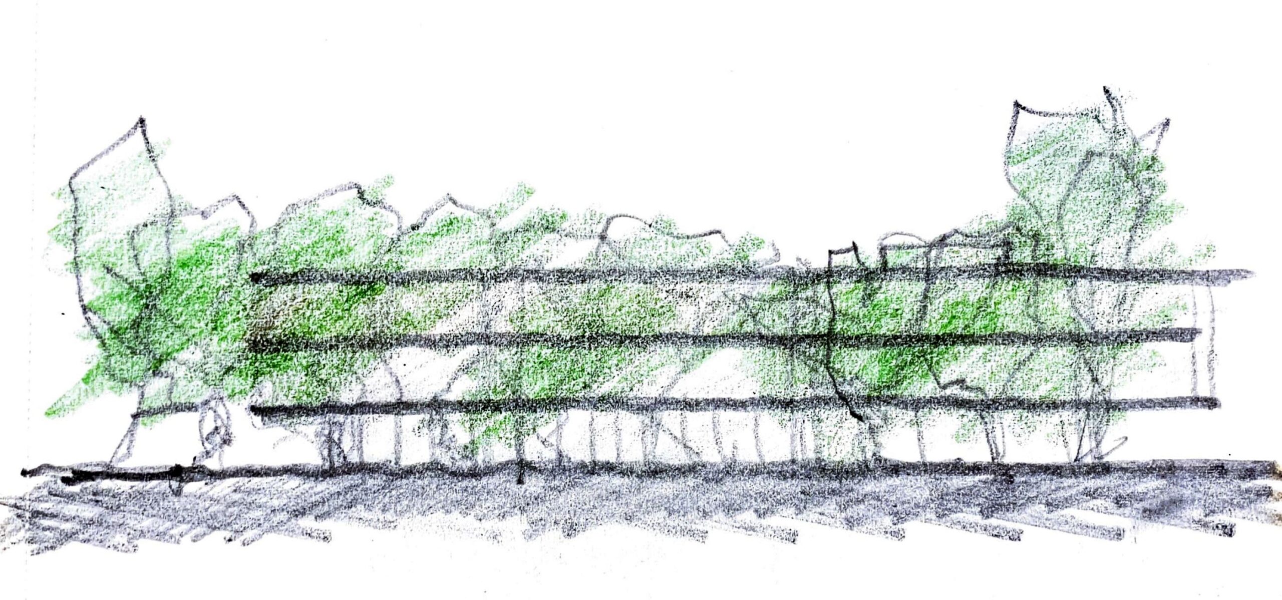
The Centre was designed to be ground plus two floors., for the building to be within the tree line and not overpower it. For the user, a three-floor building was also easy to navigate with an intimate, institutional feel.
Materiality
Reinforced concrete was proposed for the structure while the walls were proposed to be built using CSEB blocks made from the earth on-site. It was proposed to use Kota stone and locally sourced granite for the flooring, and recycled wood for the screens on metal frames. Plants and trees formed an indispensable part of the centre.
Plans


Sections
Views


